

2026-11-10
Choosing a Laminate Finish Door involves more than selecting a color from a sample book. The door becomes part of a larger visual composition that includes walls, flooring, skirting, furniture, lighting, and hardware. A finish that looks attractive on its own may feel disconnected once installed, while a subtle finish can become an important part of a coordinated interior.
Blending the door with the wall can create visual continuity and reduce the number of noticeable boundaries within a room. Creating contrast can define an entrance, introduce material character, and make a doorway easier to identify.
Both approaches have practical applications. The decision depends on the space, the design objective, and the requirements of the complete door assembly.
A coordinated door and wall palette can help an interior feel visually connected. This approach is useful when the doorway should remain part of the background rather than become a separate decorative feature.
Blending does not always mean selecting an identical color. Similar undertones, compatible textures, and a considered frame design can create a coordinated appearance even when the door and wall materials differ.
Small bedrooms, apartments, and compact offices often contain several competing elements within a limited area. Furniture, shelving, windows, and door openings can create a fragmented appearance.
Matching the door closely to the wall can reduce one of these visual interruptions. Instead of emphasizing the opening with a strong color change, the design allows the wall surface to feel more continuous.
For example, a warm off-white laminate finish beside a warm off-white painted wall can create a quieter background for a bedroom. A pale greige finish may work with similarly toned walls in an apartment hallway.
This approach does not increase the physical size of the room. Its value is visual: fewer contrasting boundaries may help the space feel less busy.
Before selecting a finish, compare the following:
A door that matches the wall can still appear strongly outlined if the frame or hardware uses a contrasting finish.
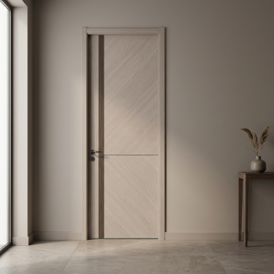
A light-colored Laminate Finish Door may support a brighter visual impression when used alongside light walls and suitable lighting. However, the relationship between surface color and room brightness is more complex than choosing white.
A pale finish can appear gray in a shaded room. A warm beige can look yellow under some lamps. A cool white door may appear disconnected beside a cream-colored wall.
For spaces with limited daylight, review the sample under the artificial lighting that will actually be used. Consider ceiling lights, wall lights, and any reflected light from surrounding surfaces.
Matching a door to a dark wall is also possible. This can create an intentional, enclosed atmosphere in a media room or private study. It should not be presented as a way to brighten the space.
Minimalist interiors often use fewer material changes and restrained detailing. A wall-coordinated door can support this approach by keeping attention on the overall proportions of the room.
A concealed-frame system may reduce the visibility of the frame, but the decorative finish alone does not create a flush or hidden doorway.
The appearance depends on several construction details:
A standard framed door can look coordinated with the wall without being concealed. Likewise, a concealed-frame door can use a contrasting finish.
Buyers should separate the visual objective from the construction specification. If a project requires a flush appearance, the supplier and installer need to confirm that the proposed assembly supports that detail.
A corridor with several bedroom, bathroom, and storage doors can become visually crowded when each opening uses a different finish.
Coordinating the doors and walls can create a calmer appearance. Consistent hardware, frame profiles, and grain direction can reinforce that effect.
This is useful in residential corridors where the aim is to reduce visual competition. In hotels, offices, or shared facilities, however, the design must also consider room identification, signage, and accessibility.
A visually discreet doorway should not become difficult to locate where clear navigation is required.
Contrast gives the door a more visible role in the interior. It can define an opening, introduce a wood-inspired surface, or distinguish a selected room from surrounding spaces.
The contrast can be subtle or pronounced. A door does not need a vivid color to stand apart from the wall.
A walnut-look door against a light neutral wall can create depth through both color and grain. A pale oak-look door against a muted green wall can create a different balance, with a lighter surface and a nature-inspired palette.
Other possible combinations include:
These combinations should be treated as starting points, not universal rules. The same pairing can feel different depending on room size, lighting, and the surrounding furniture.
Frame treatment also changes the result. A frame that matches the door creates a more defined doorway. A frame that matches the wall may soften the outline while allowing the door face to remain visible.
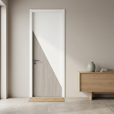
A contrasting finish can help a study, meeting room, primary bedroom, or private lounge feel distinct from neighboring spaces.
In a residential hallway, several doors might use a pale neutral finish while the study uses a textured woodgrain. In an office, meeting room doors might use a coordinated accent color to distinguish them from service areas.
The design usually feels more connected when the selected color or material appears elsewhere in the interior. A walnut-look door might relate to shelving. A gray door might coordinate with metal fixtures. A muted green door might connect with upholstery or decorative panels.
The aim is not to introduce an isolated color, but to create a relationship between the doorway and the room.
In shared and commercial environments, contrast can have a practical role. Differences between relevant surfaces may help people identify door openings and hardware.
Light Reflectance Value, commonly abbreviated as LRV, describes the proportion of visible light reflected by a surface. Accessibility guidance may use differences in LRV to assess visual contrast.
However, a dark door beside a light wall does not automatically establish compliance.
Project teams should confirm:
Color names and online photographs are not sufficient for this assessment. Where accessibility requirements apply, the specified finishes and complete design should be reviewed by the relevant project professional.
Contrast is not restricted to large interiors. A compact room can include a contrasting door when the surrounding palette remains controlled.
For example, a woodgrain door may add character to a small bedroom with plain walls and restrained furniture. The room may feel busier if the door, floor, wardrobe, and feature wall all introduce unrelated patterns.
A useful approach is to decide which element should draw attention. If the door is the feature, simplify adjacent surfaces. If the room already contains patterned tile or a decorative wall, a quieter door finish may create balance.
Recent interior-door discussions have included warm neutrals, natural wood-inspired surfaces, restrained detailing, and closer coordination between doors and surrounding finishes.
These are useful design directions rather than evidence that every finish has growing search demand. For a manufacturer website, the value comes from explaining how these ideas translate into material selection and project specifications.
Warm white, beige, taupe, and greige can create a softer transition between a Laminate Finish Door and the wall.
The challenge is undertone compatibility. Two finishes can appear similarly light while still looking mismatched. One may have a pink undertone, while the other appears yellow or green.
Instead of approving a finish based on a color name, place the door sample beside the wall paint reference.
Review the combination from a distance as well as close up. Small undertone differences may become more noticeable when the materials occupy larger surfaces.
Warm neutral finishes can support both approaches:
Wood-inspired laminate can introduce grain and color variation into an otherwise plain interior. Light oak-look finishes may suit pale, restrained palettes, while walnut-look finishes can provide a deeper visual accent.
A woodgrain Laminate Finish Door does not need to match wood flooring exactly.
In fact, two similar wood effects may appear less coordinated than two deliberately different finishes if their undertones or grain patterns conflict.
When comparing wood-inspired surfaces, check:
For larger orders, ask whether a small sample represents the appearance of a complete door leaf. A larger sample or production sample can reveal grain repetition and pattern scale more clearly.
Matte and textured laminate are not mutually exclusive. A finish can have a matte appearance and a tactile woodgrain surface.
A matte appearance may create softer reflections than a glossier surface. Texture can add detail, particularly under side lighting.
Neither characteristic, by itself, proves scratch resistance, stain resistance, or ease of maintenance. Performance depends on the specified material and supporting information.
The following comparison can help organize sample selection.
| Design Objective | Finish Direction | What to Verify |
|---|---|---|
| A quiet, coordinated wall surface | Plain color with compatible undertones | Color and sheen beside the wall |
| A wood-inspired accent | Woodgrain laminate | Pattern scale, grain direction, and texture |
| Reduced visible reflection | Matte appearance | Appearance under installed lighting |
| A defined doorway | Contrasting color or material | Frame relationship and surrounding palette |
| Consistency across several rooms | Approved finish reference | Batch controls and acceptable variation |
Using related finishes for doors and wall panels can create a connected interior scheme. This is relevant in hotel corridors, office reception areas, and residential feature walls.
The materials do not always need to be identical. A plain door finish may coordinate with textured panels through color. A woodgrain door may connect with a plain wall through undertone.
If the design requires the grain to appear continuous across a door and adjacent panels, discuss that requirement before ordering.
Pattern alignment depends on material layout, panel dimensions, manufacturing capability, and installation accuracy. It should not be assumed from selecting the same finish code.
Flooring occupies a large visual area and can strongly influence how the door is perceived.
For wood or wood-look floors, consider whether the door should repeat the warmth of the floor or provide a deliberate contrast.
For patterned tile, a plain door may reduce competition between surfaces. For quiet, large-format tile, a woodgrain door can introduce texture.
For carpet, compare the dominant color and any secondary tones with both the door and wall.
A coordinated interior does not require every surface to match. It requires a clear relationship between them.
Lighting can change both color and texture perception. A finish may look coordinated during daylight but noticeably different in the evening.
For sample review:
For a blending scheme, look for unwanted undertone or sheen differences. For a contrasting scheme, check that the intended distinction remains visible without appearing disconnected from the room.
Once the visual direction is clear, the next task is to define what will be supplied. A finish name alone does not describe the complete product.
A Laminate Finish Door combines a decorative surface with a door construction, edge treatment, frame arrangement, and hardware specification. Those details affect installation, appearance, maintenance, and suitability for the intended location.
Different suppliers may use laminate terminology for different decorative surface systems. High-pressure laminate, continuous-pressure laminate, and melamine-faced materials should not be treated as interchangeable specifications.
Ask the supplier to identify the actual surface material and its relevant characteristics.
The quotation should distinguish between:
This helps buyers compare quotations on a consistent basis rather than comparing prices for products with different construction details.
A coordinated bathroom door can look attractive beside tiled or painted walls, but visual compatibility does not establish moisture suitability.
The surface, edges, core, frame, adhesive system, and installation conditions all matter.
There is also a difference between occasional exposure to humid air and repeated direct contact with water.
For bathroom applications, confirm:
Avoid describing a complete door as waterproof unless the specific product and supporting evidence justify that claim.
For hotels, apartments, offices, and distributor orders, appearance consistency can be as important as the individual sample.
Before production, agree on the approved finish reference, grain direction, and acceptable visual variation.
Discuss how later replacement orders will be handled. A finish supplied at a different time may require another sample review, particularly if the material batch or source changes.
Useful approval records include:
These records help reduce ambiguity between the buyer, manufacturer, and installer.
A door surface is regularly touched near the handle and along the opening edge. The cleaning method should be suitable for the actual decorative material.
Ask for guidance on cleaning agents, cloth types, and any restrictions involving abrasive tools or prolonged moisture.
A visually textured finish may need a different cleaning approach from a smooth surface. Dark colors may show some handling marks differently from light colors.
These are practical considerations, not reasons to reject a particular finish. The appropriate choice depends on the environment and maintenance routine.
The following questions bring together the design and procurement issues discussed above.
No. Similar undertones and compatible sheen can create a coordinated appearance without an exact color match. Physical samples are important because wall paint and laminate reflect light differently.
Yes. A neutral interior can provide a restrained background for a contrasting door. Repeating part of the door color in furniture, fittings, or other details can help connect the design.
No. A standard framed door can use a wall-coordinated finish. A concealed appearance requires a compatible frame system and appropriate installation details.
That cannot be determined from appearance alone. Cleaning requirements and surface performance depend on the specified material. Review the supplier guidance and relevant product information.
They may be able to use the same decorative reference, depending on material availability and manufacturing capability. Continuous grain alignment requires additional planning and should be confirmed separately.
Provide the door schedule, dimensions, quantities, opening directions, wall and flooring references, preferred finish samples, frame requirements, and any applicable performance specifications.
Choose a blending approach when the aim is to reduce visual interruptions, coordinate several door openings, or support a restrained interior.
Choose contrast when the doorway should introduce material character, define a selected room, or remain more visually identifiable.
The final decision should be based on the complete setting rather than the door sample alone. Reviewing the wall, floor, frame, hardware, and lighting together turns a color preference into a clearer design specification.
For project purchasing, an approved physical sample and documented construction details provide a more dependable basis for ordering than a photograph or a general finish description.
Copyright © Zhejiang Shangpin Bense Home Furnishing Co., Ltd.

Wood Interior Door Manufacturer
 русский
 عربى
 Français
 Español