

2026-07-07
Color selection often becomes one of the earliest discussions in a door project because appearance influences how a space feels long before attention turns to structure or hardware. Once a production schedule begins, changing color usually requires additional communication, new sample confirmation, or another production cycle. For that reason, confirming color before manufacturing helps keep every stage more consistent.
A digital image rarely presents exactly the same appearance as a finished product. Screen brightness, camera settings, printing methods, surrounding colors, and lighting conditions all influence visual perception. A door that appears warm on one display may seem cooler when viewed elsewhere, while another color may look darker after installation beside different wall finishes.
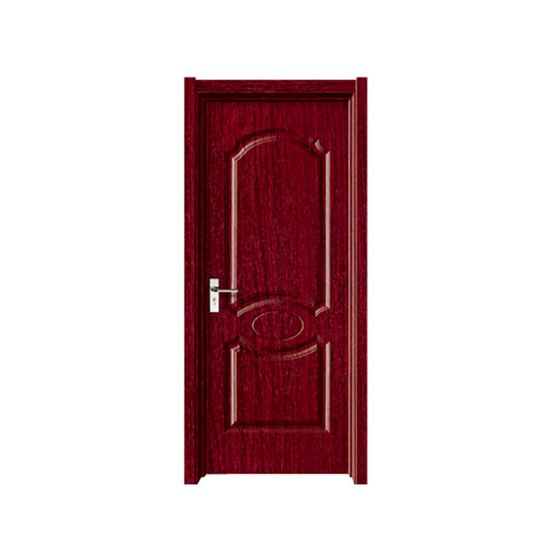
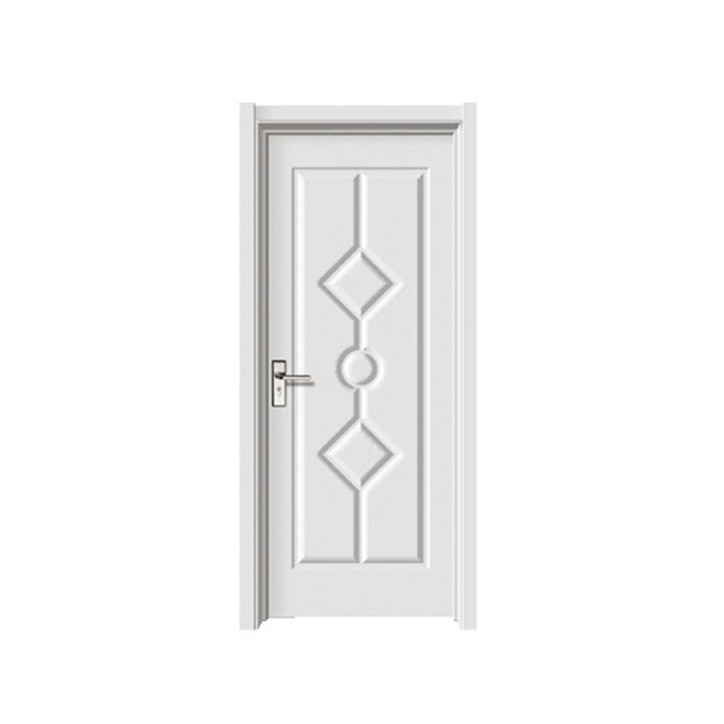
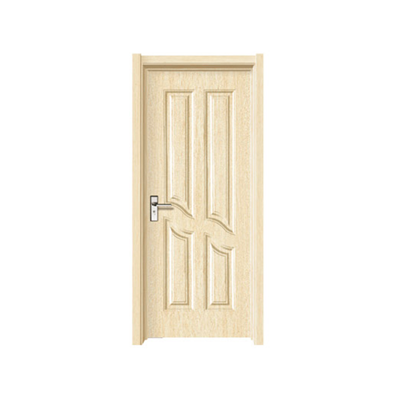
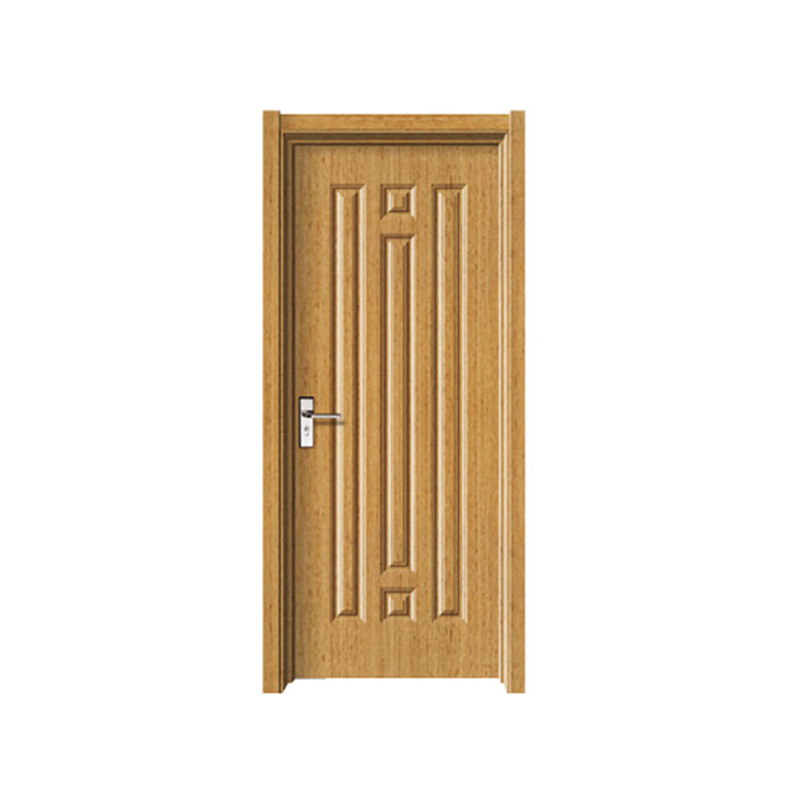
A PVC Decorative Door presents another characteristic that deserves attention. Surface texture and finish influence the way light reflects from the material. Two samples carrying an almost identical color reference may still appear different because one surface scatters light softly while another reflects it more directly. Visual judgment therefore depends on both color and surface condition rather than color alone.
Many renovation projects illustrate this situation clearly. An existing door may have remained in place for several years, while a replacement panel comes directly from production. Even when both pieces follow the same color reference, surrounding flooring, ceiling finishes, window light, and decorative trim can change the overall impression. Comparing only photographs rarely provides enough confidence before production.
Communication becomes easier once every participant refers to the same physical color reference instead of personal descriptions such as "slightly lighter" or "more grey." A common reference reduces unnecessary interpretation and allows designers, production teams, installers, and project managers to discuss the same target throughout the project.
Digital tools continue to develop, although physical color references remain common during architectural projects because they provide an object that everyone can examine under the same conditions. A printed photograph changes from one device to another, while a standardized color sample offers a stable visual reference during discussion.
Color cards are often introduced early in project planning. Rather than asking whether a color looks warm or cool, project participants compare an actual sample beside surrounding materials. Floor coverings, wall finishes, cabinets, furniture, and decorative panels can all be placed together before production begins. Small differences become easier to notice during direct comparison than through electronic images.
Another practical reason involves communication between different teams. Purchasing staff, designers, production departments, and installation crews may work in different locations. Referring to one recognized color reference helps everyone discuss the same appearance without relying on personal interpretation.
Physical comparison also reduces misunderstandings created by lighting. A sample viewed beside a window may appear different after moving into another room with artificial lighting. Looking at both the door surface and the color reference under identical lighting creates a fairer comparison.
Color cards also help during repeat production. When additional doors are required later, keeping the approved reference allows another comparison instead of relying on memory or photographs stored on different devices.
Direct comparison remains one of the practical ways to judge whether a door surface matches an expected color. Rather than looking at one object separately, both the door sample and the reference are placed together under similar viewing conditions so that differences become easier to recognize.
Lighting deserves careful attention throughout the process. Soft natural daylight often produces a balanced appearance because it reduces strong color shifts caused by certain indoor light sources. A neutral viewing environment also helps the eyes focus on the material itself instead of nearby decorative elements.
Background colors influence visual judgment more than many people expect. Bright walls, colorful furniture, or patterned flooring may change the way a surface appears. For that reason, many project teams compare samples against a plain neutral background before making a decision.
Another useful habit involves observing the sample from different positions rather than standing in one place. Light reaches the surface from different angles during daily use, especially around entrances where daylight changes throughout the day. Looking from several directions provides a broader impression of the finished appearance.
Surface finish should also be considered during comparison. A smooth decorative surface reflects light differently from a textured finish that imitates natural materials. Even when the base color remains similar, reflection changes the visual effect.
Practical checking often follows a simple sequence:
Color matching is not simply choosing a similar shade. Observation, surrounding conditions, and material finish all contribute to the final appearance.
Digital measurement becomes useful when direct comparison with a physical reference is not immediately available. During renovation work or field inspection, carrying complete sets of color references is not always convenient. Measuring an existing surface digitally creates a starting point for later comparison.
Rather than replacing physical observation, digital measurement supports communication. A recorded color value allows designers and production teams to discuss a similar reference before physical samples become available. Later, a sample comparison can confirm whether the visual appearance matches project expectations.
Digital measurement also helps when an existing door has remained in service for a long period. Human memory often changes the perception of color over time, while a measured reference provides a more consistent record for future discussion.
Although digital tools improve communication, final approval generally benefits from direct observation because material texture, gloss level, surrounding colors, and lighting continue to influence visual appearance in ways that numerical values alone cannot fully represent.
| Check Item | Why It Deserves Attention |
|---|---|
| Physical Sample | Allows direct visual comparison |
| Lighting Condition | Reduces changes caused by different light sources |
| Surface Finish | Influences reflected light |
| Texture | Alters visual appearance |
| Surrounding Materials | Helps judge overall harmony |
| Approved Sample | Provides a reference before production |
Color is often discussed as though it exists on its own, while daily observation shows something different. A door surface responds to light, nearby materials, room layout, and even the viewing position. Because of that relationship, a color approved in one place may create another impression after installation.
A smooth finish reflects light in a relatively even way. A textured surface breaks reflected light into many small directions, making the same shade appear softer or slightly deeper. Decorative films that imitate natural grain add another layer of visual variation because raised patterns create tiny areas of light and shadow across the surface.
Lighting changes throughout the day as well. Morning daylight, afternoon sunlight, and indoor lighting each create different visual conditions. None of them changes the actual finish, although each one influences how human eyes interpret color.
Nearby materials also deserve attention. Light-colored walls can make a door appear richer in tone, while darker surroundings may create a quieter appearance. Flooring, ceiling panels, curtains, and cabinets all become part of the visual environment, so judging a sample without considering nearby finishes may result in unexpected differences after installation.
Viewing distance has a similar influence. Standing close allows texture to become more visible, while stepping farther away shifts attention toward the overall appearance of the entrance. Looking from different directions often provides a more balanced impression than checking only from one position.
For that reason, project teams usually compare samples under conditions that resemble the actual installation area instead of relying on a single observation.
Production records provide another useful reference during color confirmation. When decorative finishes are prepared for repeated projects or replacement doors, recorded information helps keep communication consistent between design, production, and installation.
Instead of describing a color with general expressions, production documents normally record the selected finish together with related information about surface appearance. Keeping that information with the approved sample makes future comparison easier, especially when another order is placed after a long interval.
A production sample also serves a practical purpose before manufacturing begins. Small sample pieces allow project participants to compare appearance beside flooring, wall panels, trim, and furniture before confirming the complete order. Any adjustment becomes easier at this stage than after finished products have been prepared.
Another practical habit involves storing approved samples in a clean and stable environment. A sample that remains unchanged becomes a reliable reference whenever another comparison is needed. Project records become more valuable when the physical sample and written information remain together.
Communication between production teams and project planners also benefits from clear reference materials. Instead of discussing colors through photographs alone, everyone can compare the same approved sample and reduce unnecessary interpretation during later stages.
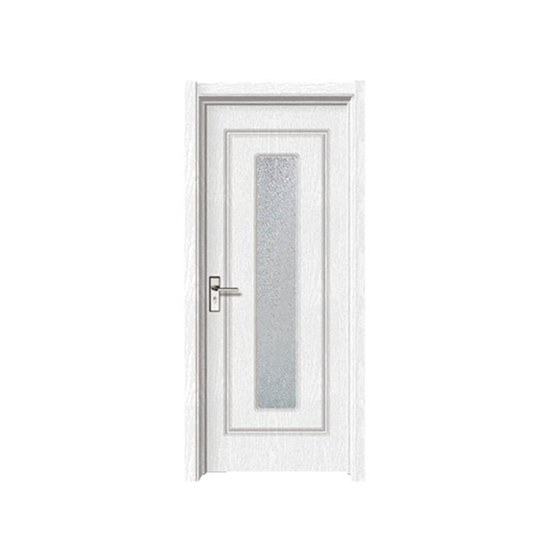
Final approval usually follows several observations rather than a single comparison. Looking at one sample for a short time may overlook details that become noticeable after the surrounding materials are added.
Several practical checks are commonly completed before production moves forward.
Attention to surrounding materials often prevents unnecessary adjustments later. A color that appears suitable by itself may create another visual effect after being installed beside different decorative elements.
Another useful practice involves reviewing replacement work separately from new construction. Existing decorative materials may have changed gradually through daily use, making direct comparison more important before confirming the final appearance.
Keeping written records together with approved samples also helps future maintenance. Replacement panels, additional doors, or renovation work can follow the same reference instead of relying on memory or photographs.
Maintaining a consistent appearance across different projects depends on careful preparation rather than chance. A reference approved during one stage becomes valuable again whenever another production run or replacement project begins.
A PVC Decorative Door often forms part of a larger decorative environment instead of standing alone. Wall finishes, flooring materials, window frames, and interior trim all contribute to the overall appearance. Looking at every element together provides a clearer understanding of how the selected finish fits within the completed space.
Project records become increasingly useful over time. Approved samples, production notes, and installation information create a reference that supports future work without repeating the entire selection process. When replacement products are needed, earlier records allow comparison with the original appearance before manufacturing begins.
Consistent checking methods also make a difference. Viewing samples under similar lighting, using the same approved reference, and comparing finishes against surrounding materials create a more stable evaluation process from one project to another.
Clear communication remains closely connected with successful color matching. Designers, production personnel, installers, and project managers often examine the same sample before work continues. A shared visual reference reduces uncertainty and makes later discussions easier to manage.
Color matching is rarely determined by one observation alone. Surface finish, texture, lighting conditions, surrounding materials, and carefu comparison all contribute to the final result. When every stage follows the same reference, a PVC Decorative Door can blend naturally into different architectural settings while maintaining a consistent visual appearance across future projects.
Copyright © Zhejiang Shangpin Bense Home Furnishing Co., Ltd.

Wood Interior Door Manufacturer
 русский
 عربى
عربى Français
 Español